Portfolio
Project
Blomster til stjernerne
Client
Bull House Media.
Scope of work.
Design and development of a full graphic package for the tv-show.
The premise
Famous and common people would compete in making the best flower arrangements.
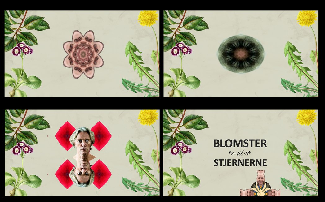
After doing an extensive research and building up a big reference library, the art direction had two ways it could go. Either a kind of an homage to the early botanics with it's fantastic illustrations, and creating a kaleidoscopic effect of the famous participants, so they would look like flowers
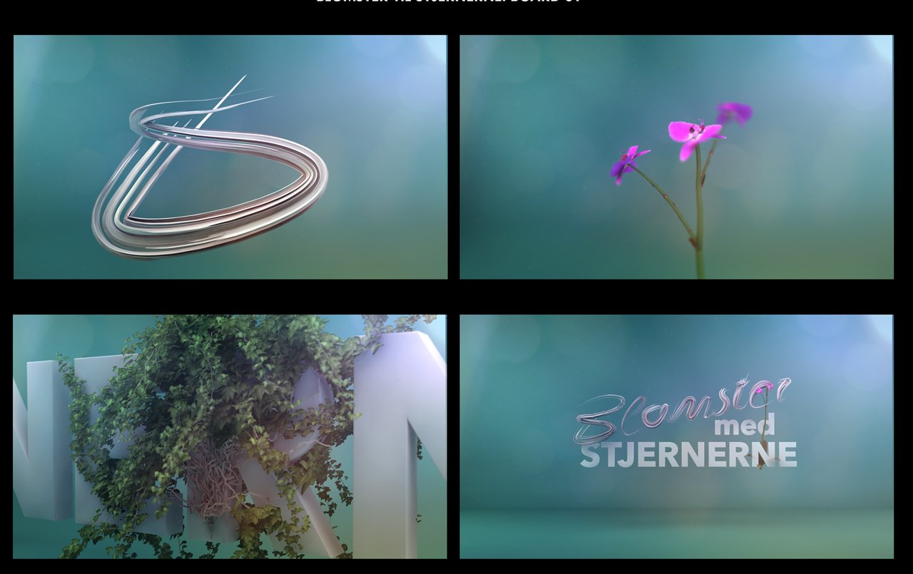
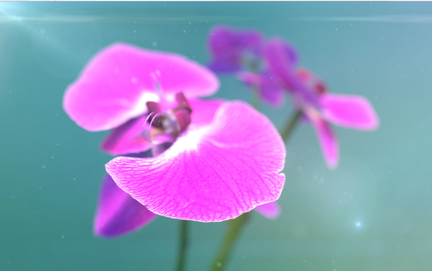
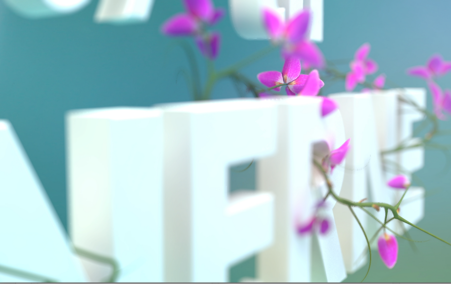
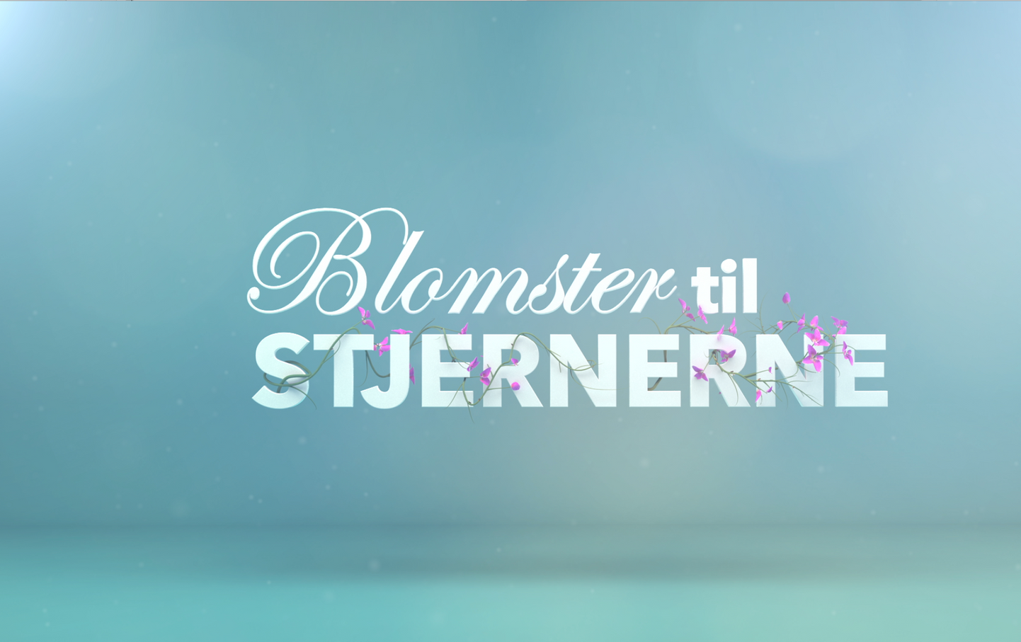
Or a more contemporary look done entirely in 3D, where the title, wines and flowers was more integrated, makes it for a more "easy read" for the audience.
The client went for the later
Styleframes
After we had gathered material for several moodboards, we came to the conclusion that there was two ideas that followed the premise the most.
Based on those two moodboards we created the styleframes that was needed to tell the story we were looking for.
The client went for solution numer two.
